Showing posts with label tutorials. Show all posts

Monday, 12 September 2016

Add 'MP3 player' to your Blogger blog

Add 'MP3 player' to your Blogger blog
Sometime we need to insert MP3 sounds to our Blogger blogs, but there is no such option available on Blogger blog, so here we are going to show How to add MP3 player' to your Blogger blog very easily; Read on:

Add 'MP3 player' to your Blogger blog


1. Using SoundCloud (Add music player by single post)
SoundCloud is a global online audio distribution platform based in Berlin, Germany, that enables its users to upload, record, promote, and share their originally-created sounds, SoundCloud is an audio platform that lets you listen to what you love and share the sounds you create.
  • Step 1: Go to SoundCloud, open an account and verify email, and login
  • Step 2: Go to Upload option, Select choose file to upload, and upload your MP3
  • Step 3: Go to Track list, select the song, Go to the track page
  • Step 4: Click on share icon (shown below)
  • Step 5: Select Embed, copy embed code (shown below)
  • Step 6: Get back to Blogger, edit post, and select HTML
  • Step 7: Now paste the copied code here and Switch to 'Compose' mode, Done now you have music player on your blog post.

2. Using Wikplayer (Add music player to Blog, universally)
Read how to add and generate here:


So don't forget to mention how it working on your blog :)

Add '3D Pressible Button' to your web project

Add '3D Pressible Button' to your web project
CSS can be used to create an awesome "call to action" button, as in the case of our 3D pressible button here. It uses CSS2 pseudo element to add a lower 3D side to the link, and CSS3 shadows and transition to complete the look. To overcome a severe limitation of Google Chrome and Safari at the time of writing not supporting CSS3 transitions on pseudo elements, we use the "inherit" technique as described here, so the 3D side of the button is animated when the user presses down on the button.  Note that the default "depth" of the 3D effect is 12px. If you need to increase or decrease this value, change the "12px" value that occurs 3 times in the CSS. Let's see how it looks like and get the source code:

Add '3D Pressible Button' to your web project


See the Pen pressable by kShazzad (@kShazzad) on CodePen.


So what you think about this button, don't forget to mention :)

Wednesday, 7 September 2016

Add 'CSS3 Black Menu' to your website

Add 'CSS3 Black Menu' to your website
Few days ago I've published Vertical text menu for websites for continue the series here I'm presenting Dashing CSS3 Black Menu with drop-down sub menu for your website. It is built with HTML, CSS and CSS3 effect transition, compatible with all major web browser and looks fabulous on any kind of website no matter their background is light or dark. Let's see how it looks like and get the source codes:


Add 'Dashing CSS3 Black Menu' to your website


See the Pen black by kShazzad (@kShazzad) on CodePen.
So what you think about this menu don't forget to mention. Check out other trending navigation menus 3 responsive navigation menu, Multipurpose navigation menu, Overlay style menu, CSS3 navigation menu style 1, CSS3 navigation menu style 2, Goodluck

Add 'Simple Neat' Search bar to your web project

Add 'Simple Neat' Search bar to your web project
I've published various kinds of search bar for Blogger and web sites, such as 6 Simple Search Bar, Dynamic width Search Bar, Black CSS3 Search Bar, Pulsating Search Bar and so on, for continue the series here I am publishing another Simple Neat search bar for your web project, which is constructed lightly with CSS, HTML, compatible with any any web browser and looks classy on any type of website, this search bar's design adapted from Apple.com. let's see how it looks like and get the source code:


Add 'Simple Neat' Search bar to your web project


See the Pen neat by kShazzad (@kShazzad) on CodePen.


So how it working on your web site don't forget to mention :)

Tuesday, 6 September 2016

Add "Image gallery with Caption" to your web project

Add "Image gallery with Caption" to your web project
Someday ago I published a tutorial about How to caption image with 4 popular CSS3 method, Here I present to you a full version of that tutorial, this is called "Image gallery with Caption", this widget is made with CSS3 elements and effects, it's easy to configure and light weighted so it will load quickly and looks slick on any types of web site, let's take a look at it shall we. Read on:


Add "Image gallery with Caption" to your web project


See the Pen Caption by kShazzad (@kShazzad) on CodePen.


So what you think about this widget don't forget to mention :)

Add 'Hexagon Shape' button to your web project

Add 'Hexagon Shape' button to your web project
I've already published some of coolest button types on Crawlist, Like CSS3 Shake button, Blinking button, 3D button etc, Here I am sharing another cool button to your web project for your web project, it's called  'Hexagon Shape' button. The interested thing is this buttons were built with single element, made with CSS3 3D perspective element. These buttons are easy to use and supports all major web browsers. Let's take a look at them, shall we:


Add 'Hexagon Shape' button to your web project


So how this button working on your site don't forget to mention :)

Saturday, 3 September 2016

Add "Accordion" widget to your web project

Add "Accordion" widget to your web project
Accordion is a type of widget that Constructed with HTML, CSS and powered by jQuery, It is a tabbed style widget that has title tabs and within title tab you can put important text, codes, image elements folded and those elements can only be revealed by clicking on title tab. Here an awesome light weighted Accordion widget source code given, Read on:


Add "Accordion" widget to your web project


See the Pen accordion by kShazzad (@kShazzad) on CodePen.
 
How to configure:
  • In <div class="accordion-item"> Item 1 place your title text
  • In <div class="data"> replace dummy text with your text
  • Don't call jquery.min.js twice
How this widget working on your web project don't forget to mention :)

Add 'Building Images' Style Slider to your webpages

Add 'Building Images' Style Slider to your webpages
'Building Images' Style Slider is a new addition to modern slider technology, the best thing about this slider is this slider is entirely coded HTML5 and JavaScript, which makes this slider very lightweight and handy. It's easily configurable and adaptable to any types of sites. Here below source code of this slider given; Read on:


Add 'Building Images' Style Slider to your webpages


See the Pen slider by kShazzad (@kShazzad) on CodePen.

How to configure:
  • If you want to change default Height and Weight, just change the all Height and Weight value
  • Add your images here; change default images
var urls = [
            'http://i.imgur.com/OeDykaH.jpg',
            'http://i.imgur.com/lLHspCj.jpg',
            'http://i.imgur.com/tCz9GQS.jpg'
        ],
  • Also change the number of images, default is 3, change 3 with your image number
for (var i = 1; i < 3; i++)

So what you think about this slider and how it working on your web project don't forget to mention :)

Monday, 29 August 2016

How to Create 'Parallax' background on Webpages

How to Create 'Parallax' background on Webpages
Parallax is a displacement or difference in the apparent position of an object viewed along two different lines of sight, and is measured by the angle or semi-angle of inclination between those two lines. In modern web design Parallax is a popular term and most wanted feature. Here in this article how to create 'Parallax' background on Webpages shown, Read on:


How to Create 'Parallax' background on Webpages

Step 1: We will create a CSS ID

#parallax {}

Step 2: We will put necessary codes to set up Parallax 
  • We used 'position: relative' cause The element is positioned relative to its normal position
  • In 'background url' Place your image link
  • We used 'background-attachment: fixed' cause The background is fixed with regard to the viewport
  • We used 'background-size: cover' cause Scale the background image to be as large as possible so that the background area is completely covered by the background image.
  • The 'height:400px' represent the Parallax area

#parallax { 
position: relative;
background:url(Image Link);
background-attachment: fixed;
background-size: cover;
height:400px;
text-align: center; 
}

Step 3: Calling out CSS through HTML

<div id="parallax">
Place your header code/text or any other elements
</div>


Now the all codes together looking like:
<style>
#parallax { 
position: relative;
background:url(Image Link);
background-attachment: fixed;
background-size: cover;
height:400px;
text-align: center; 
}
</style> 

<div id="parallax">

</div>

How it working on your web project don't forget to mention :)

Friday, 1 July 2016

25 Best jQuery Image Gallery Plugins

25 Best jQuery Image Gallery Plugins
jQuery is free, open-source software and it is the most popular JavaScript library in use today, with installation on 65% of the top 10 million highest-trafficked sites on the Web. jQuery is a cross-platform JavaScript library designed to simplify the client-side scripting of HTML. In my previous posts I posted jQuery base Free Responsive Image Slider list and Navigation menu examples Here in this article I presenting Best jQuery Image Gallery Plugins; Read on:


25 Best jQuery Image Gallery Plugins 

1. xGallerify : A jQuery Responsive & Smart Gallery
xGallerify : A jQuery Responsive & Smart Gallery
A lightweight, responsive, smart gallery based on jQuery. Completely responsive, Easy to use and customizable, Only 2.5kb file size.
Demo
Download

2. Cube Portfolio : Responsive jQuery Grid Plugin
Cube Portfolio : Responsive jQuery Grid Plugin
Cube Portfolio is a jQuery grid plugin that provides powerful portfolio system, beautiful animated filtering, custom captions and it’s perfect for portfolio projects, horizontal slider, images gallery, team members, mosaic grids or any other ordered grid content.
Demo
Buy

3. nanoGALLERY : Responsive and Mobile-Friendly Image Gallery Plugin 
 nanoGALLERY : Responsive and Mobile-Friendly Image Gallery Plugin
jQuery nanoGALLERY is a jQuery plugin that integrates with fancybox plugin to create responsive and touch-friendly image galleries with lightbox and navigation support. The plugin can display also album and images stored in Flickr or Google+/Picasa.
Demo
Download

4. Isometric : 3D Grids with CSS3
Isometric : 3D Grids with CSS3
The inspiration comes from the Hotchkiss website where an isometric, scrollable grid is shown with some cool hover effects. A scrollable grid just like the one seen on that site, with some hover effects that involve random rotations. The second demo shows some ideas for “static” grids that are not scrollable but that serve more kind of a decorative purpose.
Demo
Download

5. Filterizr : jQuery Stunning Filterable Gallery
Filterizr : jQuery Stunning Filterable Gallery
Filterizr is a jQuery plugin that sorts, shuffles and applies stunning filters over responsive galleries using CSS3 transitions. Features: Pluggable look & feel (write your CSS effects in the box on the right and hit Filterize!) , Performant: optimized for smooth experience on mobile devices, Lightweight: around 8.5kb, Responsive, Open source.
Demo
Download

6. Fluid Responsive Photo Gallery : with jQuery and Bootstrap
Fluid Responsive Photo Gallery : with jQuery and Bootstrap
A super lightweight JavaScript plugin that creates a responsive, flexible thumbnail gallery using Bootstrap grid system and displays large version of the image in a lightbox slider using Bootstrap modal component.
Demo
Download

7. Responsive Bootstrap Modal And Popup with jQuery
Responsive Bootstrap Modal And Popup with jQuery
A set of responsive Bootstrap Modals and Popups those contain bootstrap carousel, images gallery, login, signup and contact us forms, subscribe and search bars, different types videos in modal etc with new features. 100% Responsive And Mobiles friendly, 20 Ready modal style, 5 Colors Schemes, 3 Background Colors Schemes, Built With Bootstrap 3.x, 26 Animation Effects, Different Types of Sliders in the Modals     Touch swipe Enabled In Sliders.
Demo
Buy

8. Instagram Element : Instagram Plugin for jQuery
 Instagram Element : Instagram Plugin for jQuery
Instagram Element is a premium Instagram plugin for bloggers, photographers, models, and anyone looking to increase their presence on Instagram. Based off the popular Instagram Journal plugin, this jQuery plugin version allows you to easily manage 50+ flexible options and create the perfect display with just a few clicks. Furthermore its’ mobile, responsive design allows you to showcase your photos beautifully on any device.
Demo
Buy

9. mb.thumbGrid : Stylish jQuery Gallery Grid with Lightbox Support 
mb.thumbGrid : Stylish jQuery Gallery Grid with Lightbox Support
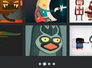
mb.thumbGrid is a jQuery gallery plugin used to display a grid of thumbnails as a slideshow with fancy CSS3 transitions. When you click on a thumbnail, the high resolution image will be displayed in a responsive lightbox that allows you to navigation through images with arrow controls.
Demo
Download

10. Responsive Photo Gallery with jQuery & Bootstrap
Responsive Photo Gallery with jQuery & Bootstrap
A simple jQuery plugin that will create a Bootstrap based Photo Gallery for your images. Supports variable height for the images and captions. An optional “modal” box with “next” and “previous” paging is also included.
Demo
Download 

11. Justified-Gallery : jQuery Justified Grid Plugin
Justified-Gallery : jQuery Justified Grid Plugin
This is a jQuery plugin which allows you to create responsive, infinite, and high quality justified gallery of images.  A common problem, for people who create sites, is to create an elegant image gallery that manages the various sizes and aspect ratio of images. Flickr and Google+ manage this situation in an excellent way, the purpose of this plugin is to give you the power of these solutions, with a new fast algorithm.
Demo
Download

12. snapGallery.js : jQuery Responsive Galleries
snapGallery.js : jQuery Responsive Galleries
snapGallery.js : jQuery Responsive Galleries  snapGallery is a super-simple jQuery plugin that converts your unordered, haphazard, differently sized images into a beautiful gallery.  Completely responsive and customizable, snapGallery allows you to select the spacing between images, the minimum width allowed before stacking and the maximum number of columns, with more options.
Demo
Download 

13. Masonry.js : Responsive Tiled Grid Layout Plugin With jQuery
Masonry.js : Responsive Tiled Grid Layout Plugin With jQuery
Masonry.js is an ultra-light (~1kb minified) jQuery plugin used to create responsive, cross-platform, tiled gallery/grid similar to the Masonry library. Works with Tuupola's image lazy load plugin.
Demo
Download

14. Moon Mega Grid plus Grand Pack
Moon Mega Grid plus Grand Pack
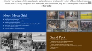
Create your unique artistic spectacular gallery for your photos with variety of beautiful animated hover effects, using templates and examples, color schemes, svg and canvas photo filters and other tools.    integrated support for canvas and svg filters, perfect for mobile devices, simple templating tools, built-in lightbox with retina support, 2 retina modes, memory saving algorithm, works either with json or html formats.
Demo
Buy

15. Ultimate Grid Pro : HTML5 & JavaScript
Ultimate Grid Pro : HTML5 & JavaScript
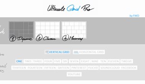
Ultimate Grid Pro is indeed the ultimate responsive multimedia grid builder packed with an insane set of features that allows to create unlimited, filterable/sortable multimedia portfolios, product swhowcase, image galleries with unlimited possibilities. It includes five grid types with vertical or horizontal layout variation (dynamic, classic, masonry, flexible and infinite) that allow to display various multimedia content in a highly customizable way. It runs on all major browsers with support for older browsers like IE8 and mobile devices like iPhone, iPad, IOS, Android or Windows mobile.  Responsive layout.
Demo
Buy

16. Gallery Content Filter With jQuery And CSS3
Gallery Content Filter With jQuery And CSS3
A jQuery based content filter which allows you to filter through a gallery of images with smooth CSS3 transition effects.
Demo
Download

17. Viewer : jQuery Image Viewing Plugin
Viewer : jQuery Image Viewing Plugin
Viewer is a simple jQuery image viewing plugin. Touch Support, Zoom, Rotation, Scale (flip), Keyboard support, Cross-browser support.
Demo
Download

18. Simple Lightbox : Touch-Friendly Image Lightbox with jQuery
 Simple Lightbox : Touch-Friendly Image Lightbox with jQuery
Simple Lightbox is a touch-friendly image lightbox for mobile and desktop with jQuery. Responsive     Touch-friendly, Lightweight, Preloading next and previous image, Android, iOS and Windows phone support, CSS3 Transitions with fallback for older browsers, Keyboard support, Easy to install, easy to use.
Demo
Download

19. Minigrid : Cascading Grid Layout
Minigrid : Cascading Grid Layout
Minigrid : Cascading Grid Layout  Minigrid is a minimal 2kb zero dependency cascading grid layout. It’s responsive and can be animated.
Demo
Download

20. jQuery Sortable Photos
jQuery Sortable Photos
jQuery Sortable Photos is a jQuery UI plugin that can display photos in a responsive, sortable grid.  The photo grid is arranged in such a way that the height of the images in each row is consistent, and the images are resized to fill in the full width. The grid can optionally be configured to allow drag-and-drop sorting.
Demo
Download

21. flexImages : Lightweight & Flexible Gallery Plugin with jQuery 
flexImages : Lightweight & Flexible Gallery Plugin with jQuery
flexImages is a lightweight jQuery plugin to create a responsive, fluid and flexible gallery from a set of any Html elements that have different sizes. Includes support for lazy load, and Ajax loading content.
Demo
Download

22. Chewing-Grid : CSS Grid ideal for Card Listing Design
Chewing-Grid : CSS Grid ideal for Card Listing Design
ChewingGrid is a CSS grid for card listing design, like videos, tiles, or article lists. It doesn’t require media queries, but it adjusts based on the maximum number of columns, and minimum and maximum card width.
Demo
Download

23. Scattered Polaroids Gallery 
Scattered Polaroids Gallery
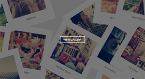
A flat-style Polaroid gallery where the items are scattered randomly in a container. When a specific item is selected, it will move to the middle while the other Polaroids will make space for it by moving to the sides. Optionally, an item can have a backface which will be shown by flipping the Polaroid when clicking on the current navigation dot again.
Demo
Download

24. Gamma Gallery: A Responsive Image Gallery Experiment 
Gamma Gallery: A Responsive Image Gallery Experiment
Gamma Gallery is an experimental responsive image gallery that attempts to provide an adjustable responsive images approach taking its grid layout and the full slideshow view into account.
Demo
Download

25. Responsive Hexagon Gallery with jQuery and CSS3
Responsive Hexagon Gallery with jQuery and CSS3
This is a jQuery & CSS3 based responsive hexagon grid layout for your image gallery that uses Geensock's TweenMax for fancy hierarchical timing animations.
Demo
Download

So which one you like most don't forget to mention :)

Thursday, 2 June 2016

10 Best 'How to sites' to visit daily

10 Best 'How to sites' to visit daily
How to sites basically wiki-style community that consisting of a wide-range database of how-to guides. There are a lots of How to site you can find on web, but which one you should visit daily; Here we made a  list for you, Read on:


10 Best 'How to sites' to visit daily

1. WikiHow 
Wikihow is the best 'How to' site it can be state as wikipedia of 'how-to' articles with more than 37,000 pieces written by volunteers. WikiHow intends to generate the best how-to content on the web. You have open account to contribute and then you will be part of a large online wiki-style community. This service uses the wiki technique of continuous betterment, letting editors to add, delete, or otherwise reform content. It has range of article categories are vast and include everything from arts and entertainment, health, and relationships, to cars, hobbies, sports , computers, and more. An Active WikiHow members take on the task of patrolling recent changes on the site, participate in various projects, keep contact through chat, forums and conference calls, and meet in person once or twice a year.

2. eHow 
eHow comes with numerous useful articles on the fly along with provides you expert tips and suggestions on topics spanning Home, Food, Finance, Health, Family, Style and much more. eHow has more than 100,000 articles and claims to have over 8 million people visiting the site every month. There are how-to videos and articles on a variety of topics ranging from cars to business, career, travel and pets, wedding and parenting. You have to create your profile in eHow and contribute articles. There are forums where you can request specific tips to be written by other members. You can also search eHow’s whole collection of articles, save your favorite eHow ‘how-to’ articles.

3. WonderHowTo 
WonderHowTo was launched in 2008. It Aimed to provide service for searching, and indexing every single awesome video tutorial on the internet as the Co Founders had come from television. But after a short period of time, the platform permitted members to contribute original articles, identifying that some topics are better read than viewed. WonderHowTo provides up to 170,000 how-to-videos & articles from up to to 17,000 specialized creators, spanning 35 vertical categories and 424 sub-categories.

4. About
About is one of the most popular and credible resource sites today with more than 53 million visitors a month. The site has around 2 million articles, videos, and tutorials on subjects including health care, parenting issues, advice on travel, cooking, technology, and hobbies, among others. A simple search on the site with the keyword 'how to' has more than 597,000 search results. That is more than any how-to site on this list.  About is fueled by more than 650 About.com Guides who mass-produce around 6,000 pieces of new content every week. You can apply to become an About.com Guide if you have the expertise to write in a particular area and the time to share.

5. HowToDoThings 
HowToDoThings was launched in 2001 and, therefore, considered to be the oldest in this business. This platform provides different categories ranging from business to careers to health to travel to hobbies to relationship and many more. The existed content on this platform’s assortment is borrowed from experts, knowledgeable, and passionate amateurs. As stated by the company, the platform has a visitor base of fewer than 6 million viewers per month. This community provides solutions based on category or you can simply search your targeted content by putting it in the search bar which is attached in the site.

6. Instructables
Instructables is packed with guides and instruction for you to make your stuff extra ordinary. Besides, you can hunt out a number of creative and innovative projects in its database comprising of up to 100,000 articles. The unique part of this platform is that it also provides video guides beside written and graphical instructions. Anyone can share their thoughts and ideas on this portal along with upload guides on almost any of your own creative projects to the site. Users can create seemly images to illustrate steps, and instructional written guide or a video.

7. ExpertVillage 
ExpertVillage is the the world's largest how-to video site and has thousands of them recorded by experts. These are all available free of cost to watch or download. Becoming a member allows you to rate the articles, bookmark your favorite entries, and make comments on the site. You can contribute to the site if you have a license from a legitimate authority or extensive experience in your field. This is one site that has this particular differentiation from the rest in this lot, as the rest accept tips from one and all. You can also apply as a filmmaker if you are good at photography, and send your per-recorded videos.

8. HowToGeek
HowToGeek is a online platform which is intended at providing magazine, interesting articles, how-to, and even fun trivia to it visitors. The service has been working to simplify the existed content so that it can easily be comprehended by regular visitors. The service comes with categories ranging from articles, discussion, subscribe, gadgets, geek school, and a search bar that offers you search whatever you are looking for on the site.

9. VideoJug 
VideoJug was launched in 2006. It provides videos in formats like 'How To' and 'Ask The Expert' on a variety of subjects like food & drink, love & sex, beauty & style, sports & fitness, health, leisure & hobbies, technology, home, pets, parenting, cars, jobs, career, travel, cars, and many more. You can upload your videos on VideoJug. There is also a forum on VideoJug where you can post questions.

10. SuTree 
SuTree aims to providing instructional guides through videos. The service comes with up to 25 categories with 85, 292 videos and a member base of 10,452; beside, there are 279 distinct courses available on this site. All of the available content on this platform is tested and affirmed by the staff before they can go live to make sure quality and upto date instructions.

So which one is favorite don't forget to mention :)

Monday, 11 January 2016

Add stylish Tooltip to your links

Add stylish Tooltip to your links
Few days ago I published a post about how to add animated underline to your sites link here I continuing the episode with another idea how to Add Cool Tooltip to your links. The tooltip is a hint is a common graphical user interface element. It is used in conjunction with a cursor, usually a pointer. The user hovers the pointer over an item, without clicking it, and a tooltip may appear—a small "hover box" with information about the item being hovered over. Generally HTML has classic style tooltip as default. Here I ma presenting a updated highend one. It’s a common trick can be found on many top level websites it done by CSS2 and 3. Let’s see how it looks like and how to add it to your links.

Add stylish Tooltip to your links


Preview: 

Add stylish Tooltip to your links


Codes for copy:

CSS:


<style>/*crawlist.net CSS starts*/

/*general style*/
.ks-tt { position: relative; display: inline-block; }
.ks-tt:before, .ks-tt:after {
    position: absolute;
    opacity: 0;
    z-index: 1000000;
    -webkit-transition: 0.3s ease;
    -moz-transition: 0.3s ease;
    pointer-events: none;}
.ks-tt:hover:before, .ks-tt:hover:after {
    opacity: 1;}
.ks-tt:before {
    content: '';
    position: absolute;
    background: transparent;
    border: 6px solid transparent;
    position: absolute;}       
.ks-tt:after {
    content: attr(data-ks-tt);
    background: rgba(0, 0, 0, 0.8);
            color: white;
            padding: 8px 10px;
            font-size: 12px;
    white-space: nowrap;
    box-shadow: 4px 4px 8px rgba(0, 0, 0, 0.3);}


/* top */
.ks-tt--top:before {
    bottom: 100%;
    left: 50%;
    margin: 0 0 -18px 0;
    border-top-color: rgba(0, 0, 0, 0.8);}       
.ks-tt--top:after {
    bottom: 100%;
    left: 50%;
    margin: 0 0 -6px -10px;}
.ks-tt--top:hover:before {
    margin-bottom: -10px;}
.ks-tt--top:hover:after {
    margin-bottom: 2px;}


/* bottom */
.ks-tt--bottom:before {
    top: 100%;
    left: 50%;
    margin: -14px 0 0 0;
    border-bottom-color: rgba(0, 0, 0, 0.8);}       
.ks-tt--bottom:after {
    top: 100%;
    left: 50%;
    margin: -2px 0 0 -10px;}
.ks-tt--bottom:hover:before {
    margin-top: -6px;}
.ks-tt--bottom:hover:after {
    margin-top: 6px;}


/* right */
.ks-tt--right:before {
    left: 100%;
    bottom: 50%;
    margin: 0 0 -4px -8px;
    border-right-color: rgba(0,0,0,0.8);}       
.ks-tt--right:after {
    left: 100%;
    bottom: 50%;
    margin: 0 0 -13px 4px;}
.ks-tt--right:hover:before {
    margin: 0 0 -4px -0;}
.ks-tt--right:hover:after {
    margin: 0 0 -13px 12px;}


/* left */
.ks-tt--left:before {
    right: 100%;
    bottom: 50%;
    margin: 0 -8px -4px 0;
    border-left-color: rgba(0,0,0,0.8);}       
.ks-tt--left:after {
    right: 100%;
    bottom: 50%;
    margin: 0 4px -13px 0;}
.ks-tt--left:hover:before {
    margin: 0 0 -4px 0;}
.ks-tt--left:hover:after {
    margin: 0 12px -13px 0;}
   
/*crawlist.net CSS ends*/</style>


HTML:


<p><a href="#" class="ks-tt  ks-tt--top" data-ks-tt="Upper Tooltip">Upper Tooltip</a></p>

<p><a href="#" class="ks-tt  ks-tt--right" data-ks-tt="Rightside Tooltip">Rightside Tooltip</a></p>

<p><a href="#" class="ks-tt  ks-tt--bottom" data-ks-tt="Bottom Tooltip">Bottom Tooltip</a></p>

<p><a href="#" class="ks-tt  ks-tt--left" data-ks-tt="Leftside Tooltip">Leftside Tooltip</a></p>


  • The CSS contains 5 part first part is main CSS you must put this code into your style sheet it will generate tooltip. And 4 others are the style preference which side (left, right, bottom and top) tooltip you want to use; copy one of them or all of them as you like.
  • The HTML has 4 individual lines for activating and using 4 different styles as your CSS preference. data-ks-tt indicates what will show on your tooltip, data-ks-tt="Place your Tooltip texts" and >Upper Tooltip</a> place your anchor text

Compatibility:
These codes are universal so they will work on any site on web browser.

So what your think about this trick don’t forget to mention, any problem feedback leave via comment. Chill

Saturday, 31 October 2015

Add animated underline links of your Blogger blog

Add animated underline links of your Blogger blog
I published couple of cool tutorial and tricks for customizing your blogs post area elements before; here to mention some notable using Google font in post, customized blockquote, syntax highlighter, setting up 404 error page, Flickr images gallery, Remove default border and shadow from images, embedding vimeo videos etc. Here to the next stage of Blogger post customization I presenting to you here animated underline links. By applying this tutorial in post all links will show different way; animated underline will appear on mouse hover on links. This trick made with CSS3 animation and it’s easy to set up. Let’s see how it works and how to add it on your Blogger blog.

Add animated underline links of your Blogger blog


Live Demo: (click here)

Codes for Copy:


<style>/*crawlist.net CSS starts*/
.post-body a, a:visited {
  text-decoration: none;
  position: relative;
  color: #3498DB;
}
.post-body a:after, a:visited:after {
  content: '';
  height: 2px;
  position: absolute;
  bottom: 0;
  left: 0;
  width: 0%;
  background: #19B5FE;
  transition: 0.2s;
  margin-top:2px
}
.post-body a:hover:after, a:visited:hover:after {
  width: 100%;
}
.post-body a.block, a:visited.block {
  display: block;
  padding: 0.5em;
}
.post-body a.block:hover, a:visited.block:hover {
  background: #fff;
}/*crawlist.net CSS ends*/
</style>


How to add:
  • Login to Blogger, select your blog,
  • Go to ‘Layout’ tab, select ‘add a gadget’
  • Select ‘HTML/JavaScript’ from pop up page
  • Copy and paste all given codes in there,
  • And save the gadget, later template
Now check your blog out for new link outlook.

FAQ and Caution:

  • This code won’t work if your template has a different name for Post body class, so if this code fails then search within your template for the class name of the post area, and replace them with my given default codes classes.
  • You can change the links and underlines color, together or separately; just find and replace the color code with your demand.
  • This code chunk made with CSS and CSS3 should work nicely on any latest web browsers.
So what your opinion about this tutorial don’t forget to mention :) Goodluck,,,

Monday, 28 September 2015

Add Featured Post slider in Blogger (homepage/below post) Carousel style


Add Featured Post slider in Blogger (homepage/below post) Carousel style
Couple of month ago I published a high-end featured post widget which can be add to sidebar of your Blogger blog. Here today I am publishing another featured post widget what you can use on your homepage or below posts. This widget is a jQuery slider also known as ticker image slider. This featured post slider is:
  • Simple: Easy to configure and customize
  • Small: Don’t take much space wherever you set it
  • Awesome: Smart and neat looking carousel style
Let’s see how it looks like and how to add it in Blogger blogs.

Add featured post slider in Blogger (homepage/below post)


Preview:

Add Featured Post slider in Blogger (homepage/below post) Carousel style
Live Demo: (click here)

Codes for copy:

<script src="http://code.jquery.com/jquery-latest.js"></script>
<script type="text/javascript" src="http://yourjavascript.com/35622252191/slider.js"></script>
<script type="text/javascript">
          $(document).ready(function(){
             $('#slider').bxSlider({
            ticker: true,
            tickerSpeed: 5000,
            tickerHover: true
          });
          });
</script>
<style>
/*crawlist.net slider CSS*/
#slider {
    list-style:none;
    padding:0px;
}

.slider-container {
    background:#fff;
    width:80%;
    height:150px;
    padding:17px;
    -webkit-border-radius: 2px;
    -moz-border-radius: 2px;
    border-radius: 2px;
    overflow:hidden;
margin:auto;
}

.newcon { width:80%; margin:auto; overflow:hidden}

#slider img {
    width:200px;
    height:125px;
    margin:0px;
    display:inline-block;
    border: 1px solid #f5f5f5;   
}

#slider li {
    width:210px
}
/*crawlist.net slider CSS*/
</style>

       
<div class="newcon">
<!-- crawlist.net slider starts -->
<div class="slider-container">
<ul id="slider">  
<li><a href='place link' title="place hover text" target="_blank"><img src="image link"/></a></li>

<li><a href='place link' title="place hover text" target="_blank"><img src="image link"/></a></li>

<li><a href='place link' title="place hover text" target="_blank"><img src="image link"/></a></li>

<li><a href='place link' title="place hover text" target="_blank"><img src="image link"/></a></li>

<li><a href='place link' title="place hover text" target="_blank"><img src="image link"/></a></li>

<li><a href='place link' title="place hover text" target="_blank"><img src="image link"/></a></li>

<li><a href='place link' title="place hover text" target="_blank"><img src="image link"/></a></li>

<li><a href='place link' title="place hover text" target="_blank"><img src="image link"/></a></li>
</ul>  
</div><!-- crawlist.net slider ends --></div>

Adding this widget on Homepage

  • First log into Blogger, select your blog,
  • Go to ‘Layout’ tab and click ‘add a gadget’ from the below space of header
  • Select ‘HTML/JavaScript’ from pop up page;
  • Copy and paste given codes in content box, configure and Save
  • Now hit ‘View blog’ and hover mouse on slider widget’s editing icon wrench;
  • And look bottom of web browser and you will see a line, that contains Widget ID;
  • Detect your widget id it generally looks like (HTML1, HTML2, HTML3, Blog1) see image below;
Add Featured Post slider in Blogger
    • Then, go to ‘Template’ tab, ‘Edit HTML’ and search for your widget ID (using Ctrl+F or Cmd+F) into code snippet;
    • You will see chunks of codes starts with <b:section and ends with </b:section>
    • Like this

    <b:section class='tabs' id='crosscol' maxwidgets='1' name='Cross-Column' showaddelement='yes'>
            <b:widget id='WIDGET ID' locked='false' title='' type='HTML'>
              <b:includable id='main'>
      <!-- only display title if it's non-empty -->
      <b:if cond='data:title != &quot;&quot;'>
        <h2 class='title'><data:title/></h2>
      </b:if>
      <div class='widget-content'>
        <data:content/>
      </div>

      <b:include name='quickedit'/>
    </b:includable>
            </b:widget>
          </b:section>
    • Identify them and place this line (see image) Before the codes chunk

    <b:if cond='data:blog.url == data:blog.homepageUrl'>
    • and at the end of code this line

    </b:if>
       
      Add Featured Post slider in Blogger
      • And Save template.

      Adding this widget below posts

      • Go to ‘Template’ tab, select ‘Edit HTML’
      • Search for (using Ctrl+F or Cmd+F) into code snippet

      <div class='post-footer-line post-footer-line-1'>
      • You may find this line twice so ignore the first time, second time copy paste codes and before all codes add this line

      <b:if cond='data:blog.pageType == &quot;item&quot;'>
      • And after all code paste this line,

      </b:if>
      • Configure and Save template

      How to configure:
      • In 'place link' place your links and add your post title in ‘place hover text’
      • In "image link" place your image link, you can host image on Blogger; just upload you image; preview them and from address bar copy image’s direct code and place them in Image link; otherwist use Tinypic-Upload your image; then copy links from ‘direct links for layout’. You should use images size of 200px width and 125px height
      • You can delete a slide content by deleting <li> to </li>
      • You can add more slide by coping <li> to </li>
      • You can also change the default image size by changing value of height and width (red marked)
      How it working on your blog don’t forget to mention and any question and feedback leave with comment. Goodluck...

      Sunday, 30 August 2015

      Add 6 stylish list/bullet to Blogger posts

      Add 6 stylish list/bullet to Blogger posts
      Blogger’s default list/bulleting system is using dots, dotting style is cool but not that much cool if you are little bit of stylish and want to stay trendy and also want to represent your lists with high-end taste. That’s reason here I am publishing 6 different style of bullet system calls Arrow, Minus, Check, Plus, Carrow and Star. Made with CSS, Google font, Sprite images and they are super easy to add; designed that way. Let’s see how they look like and how to add them to your Blogger blog.

      Arrow style

      change bullet style of blogger

      .post-body ul {margin:0; padding:6px 0; list-style:none;}
      .post-body ul li {margin:10px; padding:0 0 5px 22px; color:#222222; background-repeat:no-repeat; background-position:-67px -558px; background-image:url(https://blogger.googleusercontent.com/img/b/R29vZ2xl/AVvXsEje6dgJCsrqpIHD8Q0ValGWFL7hAoB_owR4EUzv8Wh69celYjVknFz_WDg0fE0JhimSZhv5ZQTHIM1geOarwQQInjg1qGlj0dbnB4FAeDf0_QdJ9mr8d_ynImA7h5SkNKs3Dyzn6JdeDXzq/s1600/oh.png); background-position:-303px -322px; font-size:15px; line-height:1;font-family: 'Droid Serif', serif; font-weight:100;}/*crawlist.net bullet*/
      @import url(https://fonts.googleapis.com/css?family=Droid+Serif);


      Minus style

      change bullet style of blogger

      .post-body ul {margin:0; padding:6px 0; list-style:none;}
      .post-body ul li {margin:10px; padding:0 0 5px 22px; color:#222222; background-repeat:no-repeat; background-position:-67px -558px; background-image:url(https://blogger.googleusercontent.com/img/b/R29vZ2xl/AVvXsEje6dgJCsrqpIHD8Q0ValGWFL7hAoB_owR4EUzv8Wh69celYjVknFz_WDg0fE0JhimSZhv5ZQTHIM1geOarwQQInjg1qGlj0dbnB4FAeDf0_QdJ9mr8d_ynImA7h5SkNKs3Dyzn6JdeDXzq/s1600/oh.png); background-position:-101px -520px; font-size:15px; line-height:1;font-family: 'Droid Serif', serif; font-weight:100;}/*crawlist.net bullet*/
      @import url(https://fonts.googleapis.com/css?family=Droid+Serif);


      Check style

      change bullet style of blogger

      .post-body ul {margin:0; padding:6px 0; list-style:none;}
      .post-body ul li {margin:10px; padding:0 0 5px 22px; color:#222222; background-repeat:no-repeat; background-position:-67px -558px; background-image:url(https://blogger.googleusercontent.com/img/b/R29vZ2xl/AVvXsEje6dgJCsrqpIHD8Q0ValGWFL7hAoB_owR4EUzv8Wh69celYjVknFz_WDg0fE0JhimSZhv5ZQTHIM1geOarwQQInjg1qGlj0dbnB4FAeDf0_QdJ9mr8d_ynImA7h5SkNKs3Dyzn6JdeDXzq/s1600/oh.png); background-position:-461px -163px; font-size:15px; line-height:1;font-family: 'Droid Serif', serif; font-weight:100;}/*crawlist.net bullet*/
      @import url(https://fonts.googleapis.com/css?family=Droid+Serif);


      Plus style

      change bullet style of blogger

      .post-body ul {margin:0; padding:6px 0; list-style:none;}
      .post-body ul li {margin:10px; padding:0 0 5px 22px; color:#222222; background-repeat:no-repeat; background-position:-67px -558px; background-image:url(https://blogger.googleusercontent.com/img/b/R29vZ2xl/AVvXsEje6dgJCsrqpIHD8Q0ValGWFL7hAoB_owR4EUzv8Wh69celYjVknFz_WDg0fE0JhimSZhv5ZQTHIM1geOarwQQInjg1qGlj0dbnB4FAeDf0_QdJ9mr8d_ynImA7h5SkNKs3Dyzn6JdeDXzq/s1600/oh.png); background-position:-141px -480px; font-size:15px; line-height:1;font-family: 'Droid Serif', serif; font-weight:100;}/*crawlist.net bullet*/
      @import url(https://fonts.googleapis.com/css?family=Droid+Serif);


      Carrow style

      change bullet style of blogger

      .post-body ul {margin:0; padding:6px 0; list-style:none;}
      .post-body ul li {margin:10px; padding:0 0 5px 22px; color:#222222; background-repeat:no-repeat; background-position:-67px -558px; background-image:url(https://blogger.googleusercontent.com/img/b/R29vZ2xl/AVvXsEje6dgJCsrqpIHD8Q0ValGWFL7hAoB_owR4EUzv8Wh69celYjVknFz_WDg0fE0JhimSZhv5ZQTHIM1geOarwQQInjg1qGlj0dbnB4FAeDf0_QdJ9mr8d_ynImA7h5SkNKs3Dyzn6JdeDXzq/s1600/oh.png); background-position:-619px -3px; font-size:15px; line-height:1;font-family: 'Droid Serif', serif; font-weight:100;}/*crawlist.net bullet*/
      @import url(https://fonts.googleapis.com/css?family=Droid+Serif);


      Star style

      change bullet style of blogger

      .post-body ul {margin:0; padding:6px 0; list-style:none;}
      .post-body ul li {margin:10px; padding:0 0 5px 22px; color:#222222; background-repeat:no-repeat; background-position:-67px -558px; background-image:url(https://blogger.googleusercontent.com/img/b/R29vZ2xl/AVvXsEje6dgJCsrqpIHD8Q0ValGWFL7hAoB_owR4EUzv8Wh69celYjVknFz_WDg0fE0JhimSZhv5ZQTHIM1geOarwQQInjg1qGlj0dbnB4FAeDf0_QdJ9mr8d_ynImA7h5SkNKs3Dyzn6JdeDXzq/s1600/oh.png); background-position:-580px -44px; font-size:15px; line-height:1;font-family: 'Droid Serif', serif; font-weight:100;}/*crawlist.net bullet*/
      @import url(https://fonts.googleapis.com/css?family=Droid+Serif);


      How to add:
      • Log in to your Blogger, select your blog
      • Go to ‘Template’ tab, select ‘Edit HTML’
      • Search for ]]>< into code snippet (using Ctrl+F or Cmd+F)
      • Before ]]>< copy paste any of style you want to use
      • Save template, and see the changes by visiting blog or new post editing

      Caution and FAQ:
      • Most of Template have default list/bullet style designed into template codes; and those code stays in

      .post-body ul {} and .post-body ul li {}

      So you your template already have these lines; mark them and delete them. And set my given codes.
      • You can’t use two or more style. But if you know little bit of coding then change the CSS class,

      .post-body ul {} and .post-body ul li {}
      to
      .1 ul {} and .1 ul li {}

      And in post editor switch to HTML, after listing being done; and add CSS class to following ul (like: <ul class="1">)

      So what you opinion, feedback about this tutorial don’t forget mention. Goodluck.....